Things That Make Your Home Look Dated and How To Fix Them
These things could be making your home looked dated and out of style. Here’s how to fix them!
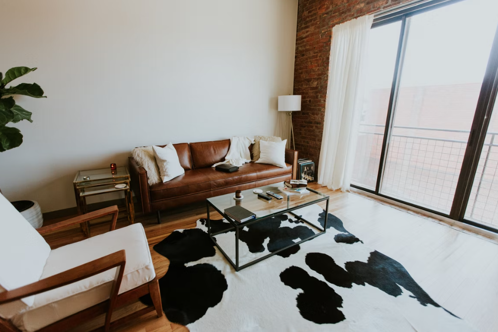
Photos By: Stock Images
With the ever-changing interior design landscape constantly introducing new trends to the general public, while instantly dismissing any fad or fashion that has fallen out of favour with the masses, it can be difficult to discern whether or not your home is looking a little dated or not.
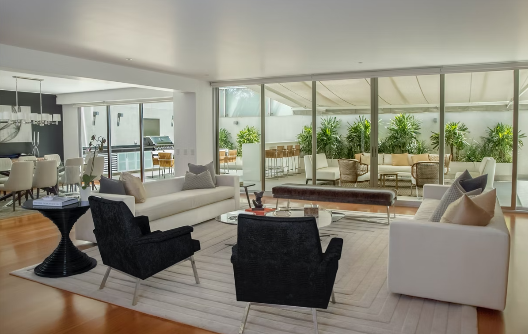
In recent years, we’ve witnessed the return of a more minimalistic approach coupled with muted tones and the introduction of statement lighting dominating the world of home and garden design. Though there is always a current general consensus that dictates what is “in” and what isn’t, most average people don’t necessarily have the time and resources to constantly keep up with the popular interior choices of the moment. If you’re looking to begin modernising your living space, stick around as we break down things that may be dating your home and how to fix them.
1. Old Wallpapers
Perhaps the most obvious tell-tale sign of a dated interior space is the usage of old traditional wallpaper, coupled with flimsy bordering to boot. Whether its print is littered with roses, leaves or quirky patterning, there is no way to make the designs of an older decade appear fashionable and chic.
2. Floor Length Mirrors
A staple of iconic 80’s interior design, floor length mirrors certainly have their cham – and their place in the history books. Their dated aesthetic is rarely cohesive with the sleek and understated design trends of the contemporary age, nor do they use up limited space in a way that could be considered productive and effective.
3. Wooden Accents
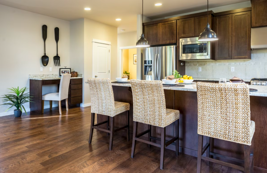
Wooden accenting has long lost its appeal to modern clientele who are generally looking to curate a sheer veneer to their homes. Aiming for a more collaborative feel by adding features such as metal furniture legs or mineral underscoring to surfaces throughout the home is a great way to circumvent the issue of living in a dated space.
4. Primary Colours
Bright primary colouring is not generally conducive to the more casual, cosier feel that many aim for when designing their home. Therefore neutral and muted tones have been on-trend for a while, and they seem to be here to stay. From playing around with black and white contrast to utilising a gentler colour scheme, there’s a lot of creativity to be found beyond a primary palette.
5. Maximalism
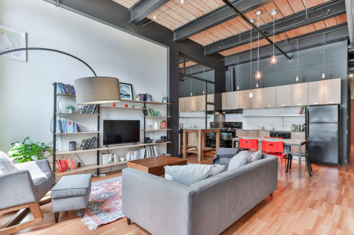
Cluttered spaces and busy walls are another feature that have fallen out of favour with pioneers of contemporary interior design, and it’s not hard to see why. With understated minimalism and clean, open spaces taking centre stage in the present-day home design market, an overly crowded house can definitely appear dated and out of touch.
6. White Appliances
White appliances tend to look out of place in kitchens that utilise dark counters and patterned countertops, which seem to be rising in popularity once again. Knowing how to build a cohesive and structured design is key when it comes to avoiding giving a room an “older feel.” Consider opting for more metallic or deeper toned furniture in the future.
7. Frosted Glass
Frosted glass is another design staple of a bygone era that doesn’t serve much purpose in modern day living spaces. With so many other choices available, from sleek clear windowing to beautiful stained glass, the frosted look can appear drab. While trying to liven up a room through modernisation, consider fluted or wire glass as a viable alternative.


